Designing a company logo may sound like a simple task, but this isn’t always the case. Join us in this article as we give you Tips For Designing Your Business Logo.
Table of Contents
Tips For Designing Your Business Logo
Unless you are a skilled Logo designer, chances are you will have to outsource the job to a professional Logo Designer or also known as a Brand Identity Designer.
This is not something you should try and create yourself in the hopes of saving money because in the long run this will have the opposite effect and more than likely damage your business image and reputation.
Designing a logo takes time and during the logo design process a lot of steps and stages must be achieved to create that perfect identity for your brand.
The trick here is to find someone who shares and understands your vision. As you begin the design process, everyone sees a potential logo from a different perspective.
The public does not always have the same perception as the brand owner, or the designer. Because of this, it’s best to keep a few things in mind as you begin the process.
Think about Logo Concepts
Before you begin, put yourself in consumer mode for a moment and think about all the memorable and popular logos that you’ve seen. There are certain qualities every logo must have to be successful.
The first rule of thumb is to keep it simple. Too many letters, numbers, concepts, or pictures confuse the idea. A logo must also be memorable and appropriate.
You want a logo to convey your brand philosophy, but if it’s not memorable, they won’t remember your brand.
It must also have versatility and strength, besides being functional across various mediums and applications.
Visualise the Design
Design is perhaps the most important concept in the creation of a logo. From a coat of arms, to company logos, marks and symbols, and even printed collateral such as business cards and letterheads, this key part of a logo will catch the public’s eye and keep them interested.
It’s a great idea to scribble down some ideas, even if design is not your forte. You want at least something tangible to give your designer so that they get an accurate idea of where you want to take your logo.
Always try to visualise you logo design in black and white before you even consider thinking about colour, you don’t want your logo to depend on colour to communicate visually. Remember colour comes last!
Try to do some rough preliminary sketches to give to your logo designer.
The more information you can give to your designer the better as information is key and this will help the designer in the research and ideation stage.
Its ok to have a colour palette in mind and let your designer know about this as not every logo out there is black and white but the key is to have your logo work well in black and white as well as colour you can also add colour to your preliminary sketches if you like.
We work in black and white when first designing the logo even if we have a colour palette from the client our focus is to get that logo to work well in black and white colour is added later on in the design process.
Moving forward your overall brand will have its own colour system that it uses on graphical elements and marketing collateral that represent your brand.
So it’s always important to think about and consider colour but at this stage it’s not the most important area so don’t get too hung up about colour.
You want your designer to truly understand your brand and the message it conveys so give them a few ideas they can work with and the assortment of different colours you have in mind.
Avoid Borrowing and Clichés
Once an idea gets popular in the logo and graphic design world, it has a tendency to really take off also known as Logo Trends.
This is an area you need to tread carefully. While you want your logo to be noticed, you also want it to be versatile and long-lasting.
Try to avoid using any type of design clichés (ideas as light bulb pictures, for instance) or borrow from other brands (notice that many tech logos suddenly have the same designs).
Try to use the name of the company as creatively as possible. Take a look at Amazon.com logo, noting that the arrow points from the A to the Z in the logo.
This is no accident, and a clever twist used to convey that Amazon sells everything from A to Z and the smile a customer has when they have purchased the item they wanted.
Some other great examples of clever logo design that come to mind are:
The Apple logo and you may be wondering why it has a bite taken out of it. So the reason for the bite is crystal clear: it’s there for scale.
It was also sort of an iconic treatment that would ensure the logo burns into people’s mind and becomes memorable. The logo is timeless.
Let’s admit that an ordinary Apple icon without a bite would not be as memorable. The current logo is beautiful in its simplicity.
The Apple logo has been around for 30+ years so obviously taking a bite of the apple so to speak was worth the bite and I don’t think it will ever be changed in the foreseeable future.
Another popular design aspect in famous logos is the use of negative space and a few big logos spring to mind.
The FedEx logo look like a plain text based logo but if you take a second look between the E and the x you will see an arrows which represents the speed and accuracy of the companies’ deliveries.
At first glance the FedEx logo looks like a plain text based logo but when you take a closer look between the “E” and the “X” you will see an arrow which represents the accuracy and speed of their deliveries.
One of the more obverse big negative space logo designs is the old Formula one logo.
I hope you can see the negative space “1” and I’m assuming you knew it was there again the logo is very simple with the “F” negative space “1” and the red lines to create the impression and sense of speed a clever logo indeed!
A not so obverse negative space logo design is the Toblerone logo.
There are still many people out there that don’t know about this one and you may be surprised as well. If you look closely in the mountain you may be able to see it.
The Toblerone logo contains the image of a bear hidden in the Matterhorn Mountain, which is where Toblerone originally came from.
Choose Fonts Wisely
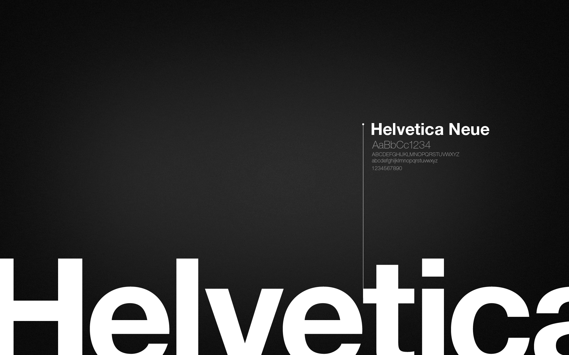
Different and unusual fonts are also a great idea. A lot of things are in standard, Times New Roman or a similar font. Helvetica is also a very popular font and a typeface that is used by many designers quite often and there’s a reason for that!
The typeface was designed in Switzerland in 1957 by Max Miedinger and Eduard Hoffmann at the Haas type foundry
It has received numerous awards and worldwide recognition, the typeface also has its own documentary and books about it.
Don’t be afraid to branch out, and grab the customer’s attention with a readable, but eye-catching font.
Be Flexible
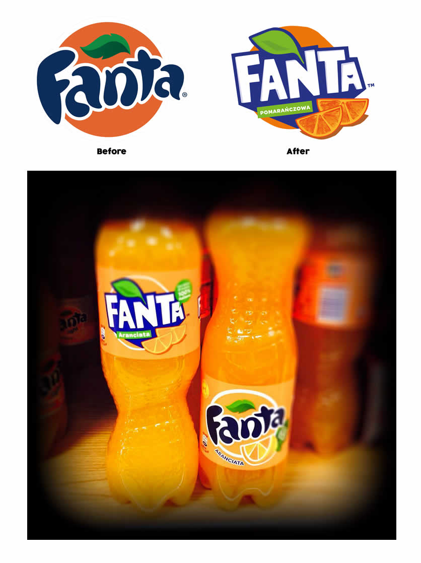
Think about extremely popular logos and how they have changed over time. (Popular Fizzy Pop brands are a great example).
Don’t expect instant success with any type of logo or marketing strategy that you will apply. But if the logo doesn’t succeed over time, it’s perfectly acceptable to change it.
Don’t rush to change a design too soon – even the Nike logo took years to take off in fact Nike founder Phil Knight told Carolyn Davidson “I don’t love it,” “but I think it will grow on me.”
If it meets all of the criteria (simple, versatile, adaptable and memorable), then chances are that in time it will be a winner.
Remember the logo does not need to explain what a company does, it needs to be an identifier for you brand, and this is a trap that many people fall into.
Conclusion
There really is no right and wrong way to create a logo. However, it’s a good idea to look at other companies and learn from them.
A logo can make or break your company and seriously damage your reputation – keep in mind from a consumer perspective.
- Customer Perception – The customer’s perception when first seeing your logo think about emotion and how it makes them feel.
- Developing trust – Generic logos create poor perception for your brand, this makes it to build trust between your business and the customer a good unique well designed logo helps establish credibility for your brand
- Creating loyalty – as the saying goes when there is trust there is loyalty and customers will tend to go back to what their familiar with
Customer perception, trust, and loyalty, all create a chain reaction in effect towards your company’s performance.
It’s important to take note of how a logo can potentially influence your brand and its target market.
In the end, logos are deemed to be the first impression so don’t create confusion and a negative perception towards your brand.
Make sure your logo can accurately represent your business. Leave your target audience knowing your appropriate, make sure your logo catches their attention.
Another article you will find interesting is a guest post written by Logo Grab on our website. The History of the Logo
Learn Logo Design Online
If you’re looking to learn logo design online in your own space within your own time, check out the online masterclass.


